Table of Contents
- The Pain That Nobody Talks About
- The Story of the “Perfect” Website That Flopped
- Why Pretty Doesn’t Pay the Bills
- The Psychology of Why Customers Don’t Convert
- How to Turn Browsers Into Buyers
- The Real Takeaway for Small Business Owners
The Pain That Nobody Talks About
There’s a certain silence that happens in the small business world when things don’t go the way we thought they would. It’s not like the movies where failure is dramatic and loud — most of the time, it’s quiet. It’s a slow drip of disappointment every time you log into your analytics and see nothing moving. It’s the awkward moment when a friend asks, “How’s the new website doing?” and you force a smile because you don’t want to admit the truth.
If you’ve ever started a business in the US, you know the drill. You save, you plan, you hustle. You hire a designer because you’ve been told over and over that your website is your “digital storefront” and that first impressions are everything. You go all in — fonts that look like they belong in a luxury magazine, color palettes that scream sophistication, product photos that could be in Vogue.
And yet, after all that investment, the sales don’t match the beauty. You check the numbers and see clicks, maybe even decent traffic, but nothing is moving into your bank account. The hardest part is realizing that you did exactly what the experts said, and you still ended up here — with a website you’re proud to show people, but that isn’t paying you back.
The Story of the “Perfect” Website That Flopped
Let me share a story that I’ve seen play out more times than I can count, but this one hits home. A close friend of mine, Lisa, opened a boutique in Austin. Lisa isn’t just good at what she does — she’s brilliant. She had an eye for style, knew her audience inside out, and had products that people genuinely loved. She believed, like many of us do, that if you built something beautiful, customers would naturally follow.
She hired one of the best design agencies in town. The website was nothing short of a masterpiece — it had cinematic product videos, a homepage layout that could win awards, and typography that felt like it belonged in a luxury coffee table book. When the site launched, it was a social media event. People shared it. Commented on how professional it looked. There was this buzz in the air, like the kind you feel before a grand opening.
Three months later, the excitement was gone. When we looked at her sales numbers, reality hit like a brick wall. Fourteen online sales. Not fourteen per day. Not even fourteen per week. Fourteen total. The kind of number that makes you want to close the laptop and not open it again for a while.
It wasn’t that her business idea was bad or her products were overpriced. It was that she had built a gorgeous showroom — but one where customers didn’t know where to walk, what to look at first, or how to check out. The beauty was there. The money wasn’t.

Why Pretty Doesn’t Pay the Bills
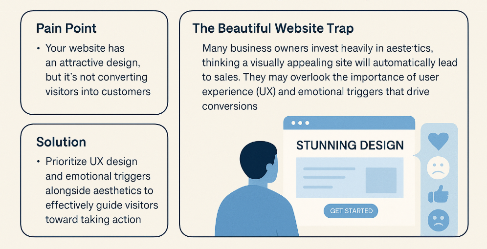
There’s a misconception that lives deep in the minds of new entrepreneurs — the idea that looking professional is the same thing as being profitable. We assume that a sleek design automatically communicates trust, that it will magically turn visitors into paying customers. But here’s the thing: customers don’t make decisions based on how perfect your gradient is or how cinematic your product video feels.
They make decisions based on gut instincts, emotional triggers, and the immediate clarity of “this solves my problem” or “this is exactly what I’ve been looking for.” A beautiful site can help build credibility, but it can’t carry the sale alone. When someone lands on your page, they’re not giving you a design critique. They’re subconsciously scanning for cues: Can I trust this person? Do they understand my problem? Do I feel confident enough to hand over my credit card right now?
If your site fails those invisible tests — even if it passes the visual test with flying colors — they’re gone. And in today’s online world, “gone” means they’re probably not coming back.
The Psychology of Why Customers Don’t Convert
Think about the last time you walked into a physical store that looked incredible but felt empty. The lighting was perfect, the shelves were immaculate, the products looked like they belonged in a magazine — but there was no one there to greet you, no signs to guide you, no energy that made you want to stay. That’s exactly what a lot of websites feel like.
Online, the problem usually starts with vague messaging. Business owners want to sound impressive, so they put headlines like “Innovative Solutions for a Brighter Future” on the homepage. It sounds big and visionary, but it doesn’t tell the visitor anything concrete. Customers don’t want poetry. They want clarity. They want to know, in the first five seconds, “Is this for me?” and “Can you help me?”
Then there’s the missing emotional spark. We make buying decisions with our emotions first and then justify them with logic. If your site doesn’t make visitors feel something — urgency, excitement, belonging, even a fear of missing out — you’ve lost them before they even consider the price. Add to that hidden or unclear calls-to-action, too many options that overwhelm rather than guide, and you’ve basically built a museum instead of a marketplace.
How to Turn Browsers Into Buyers
Fixing this isn’t about scrapping your design; it’s about layering the right psychology on top of it. Start with clarity. Your homepage should have one clear promise front and center, one that speaks directly to the customer’s pain. Not “Welcome to XYZ Company” but “Finally — Shoes That Don’t Hurt After 10 Hours on Your Feet.” That’s the kind of line that grabs someone in an instant.
Then, rewrite your copy so that it talks about your customer’s life, not your company’s journey. You can tell your story later, but first you have to show them that you understand theirs. Next, add emotional triggers throughout your site. This could be scarcity (“Only 5 left in stock”), social proof (“Over 1,000 happy customers”), or a sense of belonging (“Join the movement of women who shop smarter”).
Make the next step obvious — whether that’s “Shop Now,” “Book a Call,” or “Get Your Free Trial.” It should be impossible for someone to leave your site without knowing exactly what you want them to do. And finally, test everything. Use analytics to see where people drop off, then adjust. It’s not a one-and-done job; it’s an ongoing process.
The Real Takeaway for Small Business Owners
Your website is not an art gallery. It’s not there to win design awards. It’s a salesperson that should work harder than anyone on your team. A salesperson who doesn’t sleep, doesn’t take breaks, and is always ready to close the deal. If that salesperson isn’t bringing in revenue, you either train them better or replace them.
In the US small business world, where competition is fierce and attention spans are short, you can’t afford to let your site be a silent bystander. You have to make it your most persuasive, emotionally charged, customer-focused sales tool.
When beauty and psychology come together, that’s when the magic happens. That’s when you stop hearing “Your site looks great” and start hearing the only feedback that matters: “I just placed my order.”


